
It’s been almost a year already since I launched the latest design of this website. I wanted a dark, responsive design with larger fonts and for the most part, I’ve been very happy with the result. This week I made a few more tweaks to the font sizes and padding, as I thought the headlines on mobile devices were a little too big. I’m also not sure my viewport settings are 100% correct, so I need to spend a little more time on the mobile validation sites.
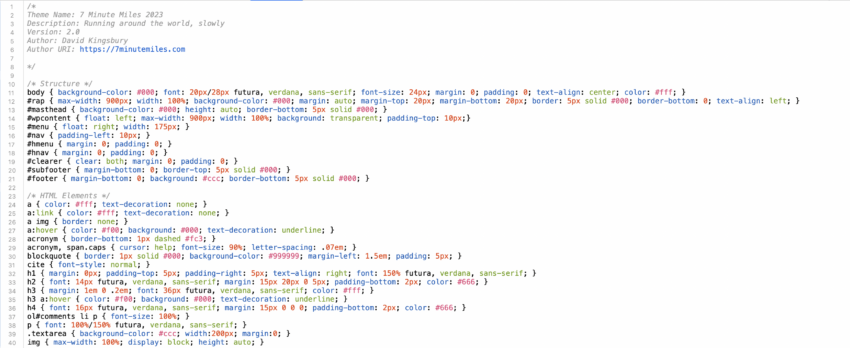
One of the things that I love about personal web publishing is that you can generally code pages to the exact standard you want. I’m not a professional designer by any stretch, but I generally know what I like (and there are a million examples online of what not to do). I also love reading brand guidelines from big companies that aim to preserve their look and feel. Here are some of mine:
- Colors: black (#000), white (#fff), red (#f00) and gray (#ccc)
- Fonts: Futura, Verdana and sans-serif
- Photo captions: italicized
- Image width: 1000px (was 850px)
- Image styling: 25px white borders, film frame for concerts and movies
I still support five primary post types on this site: standard, image, link, quote and status. Each of these have their own sections in my style sheet and the home page template has if/then loops to lay each one out differently. Made a few tweaks this week to the quote and link styles (and don’t really use status now).
Comments have been off here for a long time now and I still feel that most public websites are better without them (hope the Star Tribune will eventually turn them off, along with their annoying auto-refresh tag). I do wish there was a better way for people to communicate with me here – perhaps there are some creative plugins I’ve yet to discover. A few other editorial choices at 7 Minute Miles: no ads of any kind and (starting this week) no more jumps on longer posts (i.e. – “click to read more” links).
At some point, I may go back and try to re-style some of the images for the current design standard. When I used to have a white background, I’d often use black drop shadows in Photoshop and now those images just don’t work right. My CSS file still has a bunch of entries that I could probably remove without breaking anything. Also thinking about adding back an RSS icon (with a link to the feed) and creating some personal business cards with the site design elements.
The annual site anniversary post isn’t scheduled until March, but I did take a look at the WordPress Jetpack stats for this site in 2023: 6,406 visitors, 19,074 views and 822 likes. Two very old golf posts still are the most popular: past champion “Reflections on Spring Hill Golf Club” with 238 views and the new #1, “Somerby Golf Club Notes” with 326 views.
Thanks for visiting!
Edit (2/2/24): changed the image styling standard to a 10px white border